Counter Magazine Spread


The article “There is No Such Thing as Neutral Graphic Design“ is intended for designers to realize that even typography and design standards are only standards for a “normal person“. It breaks down how “normal“ actually means a privileged straight cisgender white man. Because they are the people in power, they have made our systems the way they are, including design systems.
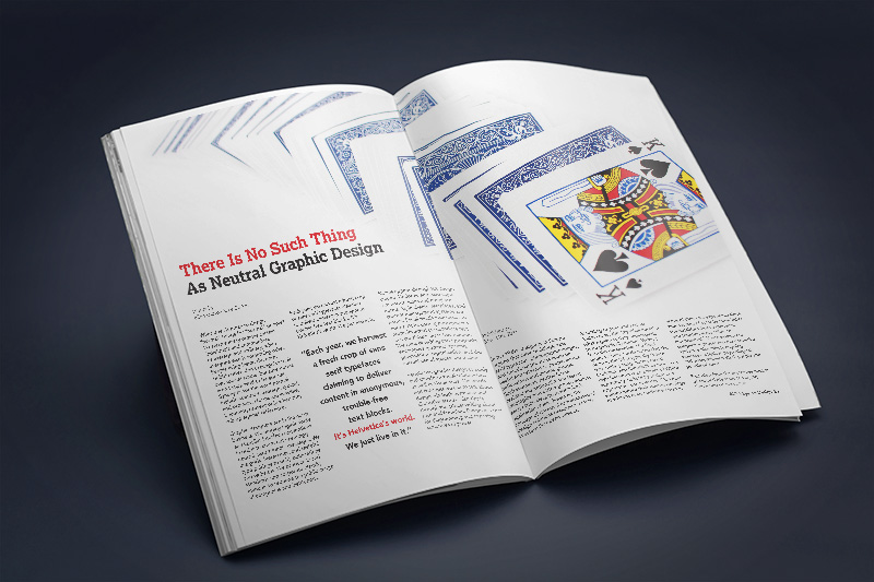
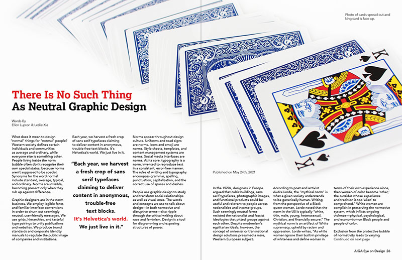
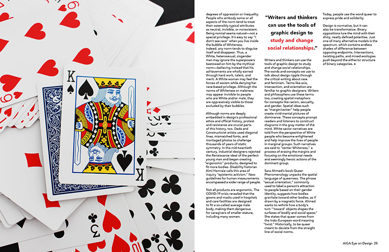
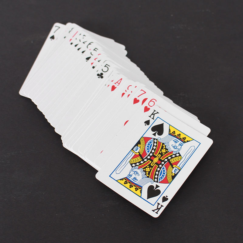
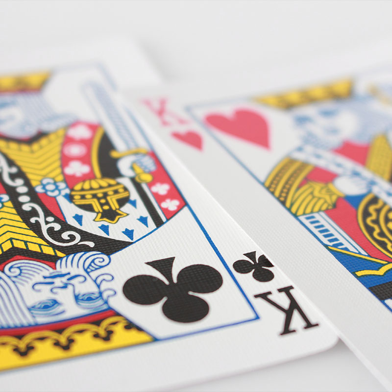
The visual metaphor used compares a deck of cards to today’s society. The king is the “normal” card (which it is not) while the other cards are other. The king is just another card overall, but is decked out in patterns and bright colours. This literally shows he has privilege. He also happens to be, a straight white and most likely a cisgender man. In both photos he is shown amongst the other cards, yet he is photgraphed as the focal point.
The king is also what the article refers to as “the mythical norm”. “the norm in the US is typically ‘white, thin, male, young, heterosexual, Christian, and financially secure.’ The mythical norm is an artifact of White supremacy, upheld by racism and oppression”.
The typeface selections attempt to match the typeface on the cards photographed. The serif title is nearly the same as the cards, while the sans-serif body copy is similar but simplified.
Overall, the article’s objective is to make the reader think about white-privilege and how remnants of European colonization are embeded in our brains. A deck of cards is literally an example of design prioritizing the white man.